Create a startpage for your application - Prenly
The start page is where everything in your app comes together. From here, you can guide them to your latest publication, older issues, articles, the latest podcast episode, or the content of your custom tabs in the mobile apps.
All this is done by adding the right components, such as banners, flashbacks, podcasts, text, etc.
To be able to manage the start page, you need to have the Application Manager role or higher.
Below we go through how to create a start page and how the different components work.
How to set up a start page
1. log in
Log in via https://content.textalk.se with the user information you received from Textalk support.
If you have forgotten your password, you can reset it via the Forgotten Password service.
If you have forgotten your username, contact support via hello@prenly.com.
2. Select applications
In the menu you should now see the option Applications (if you have the right authorization). Select the application you want to build/manage a start page for.
A tip is to first look under Application settings so that your title is entered in the application. Read more here.
Under the Home tab, build your page with optional components:
All optional components
Carousel
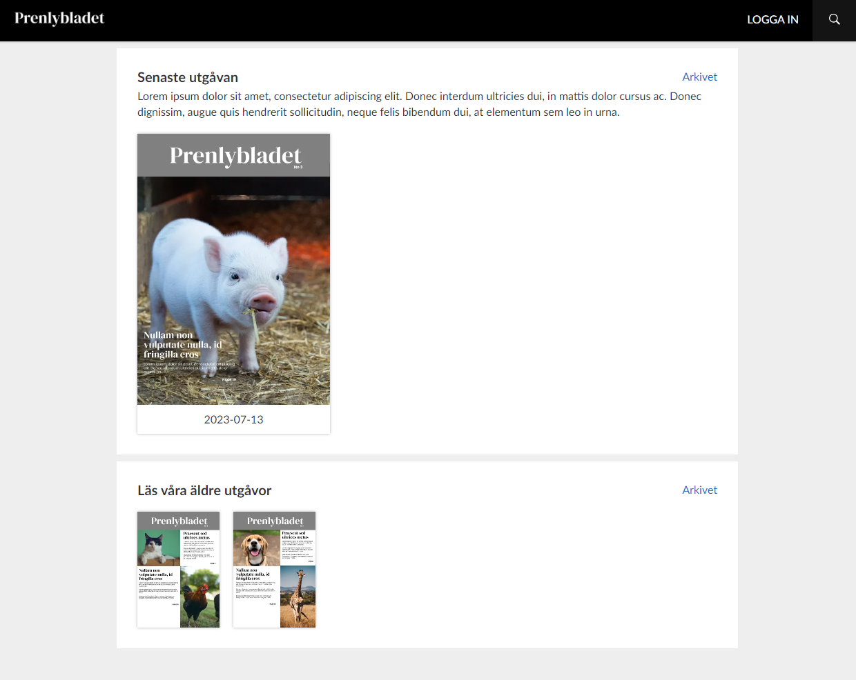
Present the latest issue together with all parts and annexes, show the last 7 issues, highlight interesting annexes. Available in four different sizes.
Editors Choice
Highlight one or more publications of your choice from the archive in a carousel. Available in four different sizes.
Banner
Make your own design and upload as an image. Can link to external URL, publication, login, application or be completely without link.
Flashback
Take your readers back in history and rediscover old issues and articles. What really happened 1, 5 and 10 years ago?
Articles
Highlight articles directly on the start page to encourage reading. There is also the option to enable article audio playback directly on the start page.
Podcast
Highlight the latest podcast episodes.
News item
Display the latest issue of a newspaper, supplement or magazine, select a special issue to highlight to your readers.
Hero
Highlight an issue of a newspaper or magazine that is particularly important, such as the latest issue or that special publication everyone should see.
Text
Welcome your readers, tell them about your app, your vision or just take the opportunity to wish your readers a great day.
Rights container
If you have many titles in your application, you can choose to show only what a reader subscribes to. Fill the container with, for example, carousels to present the reader's newspapers.
Web content
Make content in your custom tab more visible by showcasing it directly on the start page.
This requires the use of JS Bridge and a custom tab set up.
3. add a carousel
We start by adding a Carousel to display the latest publication.
- Name the carousel so you can keep track of what it contains later (e.g. "Latest publication".)
- Choose between four different sizes to display. Test what works best for your title. In this case we choose an Extra large.
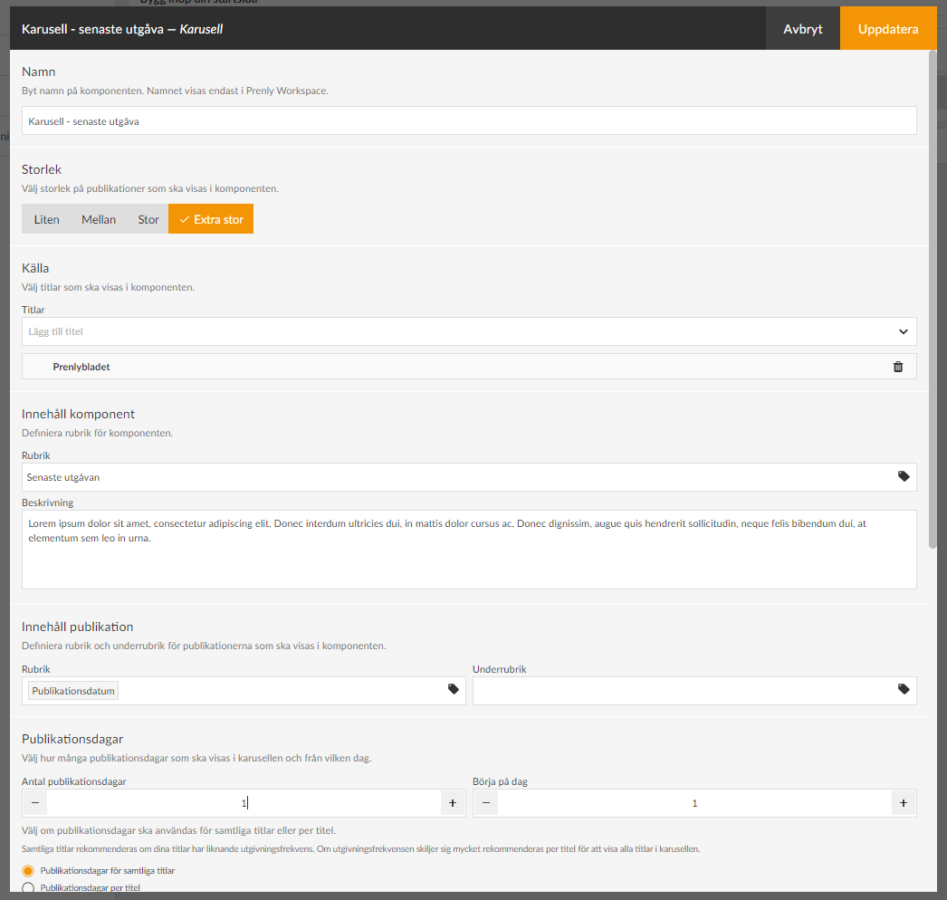
- Under Source, select the titles to be included in the component.
- Under Content component, put a Heading that your readers will see (e.g."Latest edition"). You can also write a descriptive text if you want.
- Under Publication content, you define how your title will be presented in the carousel and the publication date.
For the title, click on the tag icon and select, for example, Publication date. It is also possible to have a subheading that could, for example, be the name of the title if you have several different titles displayed in the same carousel.
- Under Publication days , first select the number of days of the title to be displayed in the carousel. Keep in mind that the number of titles displayed in full depends on the size you selected (see above) and the unit in which the start page is displayed. In our case, we set 1 publication day to show only the latest publication.
- Under Start on day, you can choose to skip, for example, the latest publication and start on day 2, which will be useful in our next carousel. We leave this on 1 in this case.
If you have several titles displayed in the carousel, there is also a setting to show the number of publication days per title.
We recommend that you select the Publication days option for all titles if your titles have a similar publication frequency. If the publication frequency differs a lot, it is recommended per title to show all titles in the carousel.
- Under Text on archive link you can change the text Archive which is set as default. For example, if you want to write "See the whole archive" instead.
- Under Download you can set whether the publications in the component should be able to be downloaded offline from the start page, then a download icon will appear.
- The Appearance section allows you to change background colors, text colors, etc. in the component. We will leave them as default for now.
- The last selection is Time limit. Here you can control whether the component is displayed for a specific period of time. You can choose either start time, end time or both.
If a component has no required content, such as Title, the checkbox will be grayed out and cannot be activated until it is filled in, to prevent empty components from appearing on your start page.
Use the drag-and-drop menu to put the components in the order you want them to appear on your start page.
4. Save component
When you are done with the configuration, select Update in the top right corner. The component is now prepared for publication but is not yet visible to the reader.
The checkboxes allow you to activate or deactivate components. Only active components will be visible.
5. Create another carousel to show more issues
We add a new carousel to show the last 2-15 issues. Follow the steps above for more detailed instructions:
- Select size Medium.
- Add the title.
- Set the title to e.g. "Read our older publications".
- Set the number of publication days to 15 and start on day 2 (i.e. skip the latest publication which is already above).
- Update.
6. other settings
Make sure to also add your logo and brand colors so that your app feels familiar and clearly connected to your brand.
Select the Background and top bar section. Here you can set the color of the top bar, the text color, and whether you want a different background color on the start page. More color settings can be found in the menu on the left under "color theme".
You can upload a logo by clicking on Browse and selecting a suitable image.
Here we can also choose to hide the top bar for the mobile version of the app (Android and iOS) but we leave it visible in this case.
7. Publish your start page.
Now we have a basic configuration of the start page ready and we are ready to publish it.
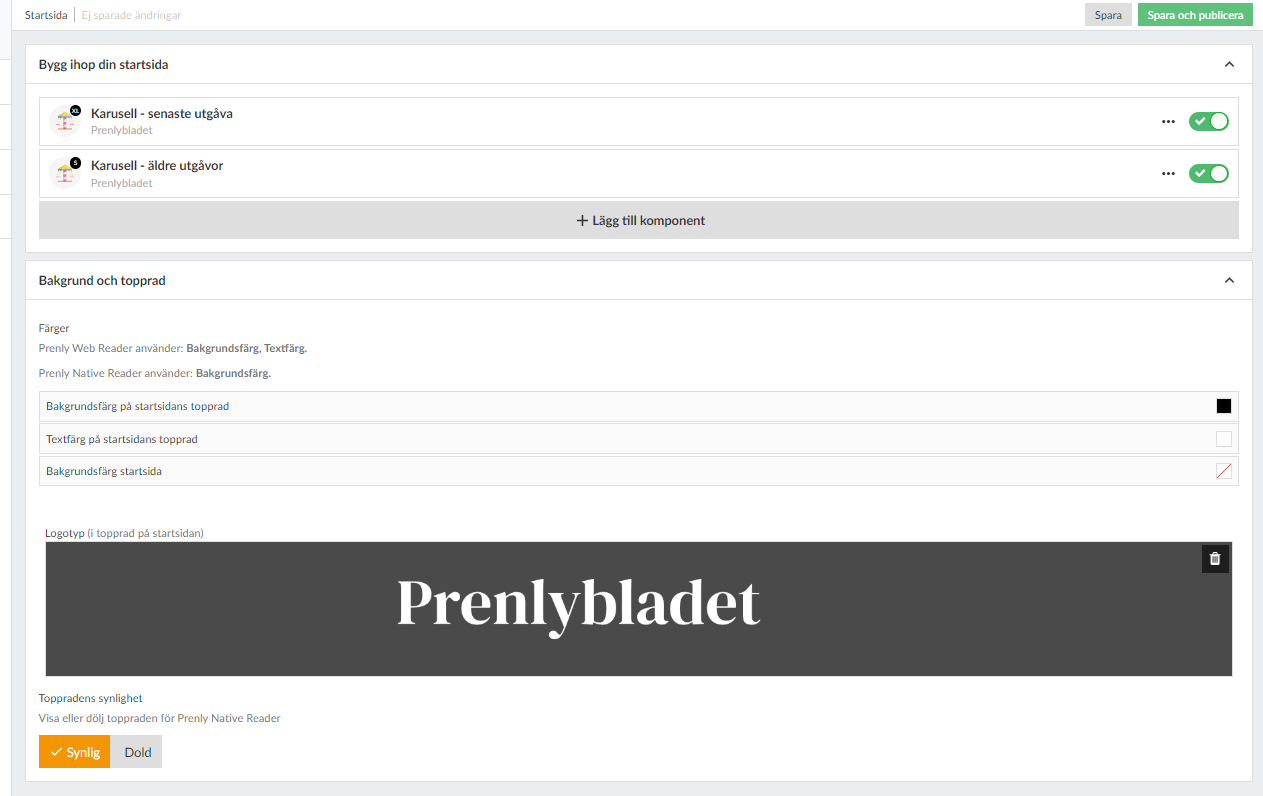
After each component there is a checkbox to activate the component. We drag it to the right so that it turns green and then click the Save and Publish button in the top right corner to finalize the setup.
Congratulations, you have now created your start page!
8. Delete or modify a component
If you want to remove a component from the start page, you can either deactivate it (if it will be used again later) by changing the checkbox to gray or click on the three dots next to the component to select Delete. If you want to change something, just click on the component to open its settings.
Remember to save and publish each change!
Note: If a checkbox is gray, it means that the component lacks the required content and it cannot be activated until it is complete. A black checkbox means that the component is inactive, but can be activated. A green checkbox means that it is activated but not published until you click Save and publish - you do this when everything is ready.
9. add more components
Now you can start exploring our other components that, along with the carousels, will enhance the reader experience. For example, you can use a banner for ad slots, podcast feed and highlight articles from the latest issue. Try it out!