Accessibility - Prenly
Digital accessibility is important from several perspectives, and many people benefit from applications being as accessible as possible.
This can include situations when you use tools such as screen readers or a keyboard, but also, for example, when you're standing in sunlight with your phone and can't see the screen properly, or when you're carrying something and only have one hand free to operate your device.
There are general guidelines for digital accessibility: the Web Content Accessibility Guidelines (WCAG).
To comply with these, there are certain things you need to ensure in Prenly Workspace.
With the help of Prenly Workspace, you have the opportunity to adjust your settings to meet these guidelines.
Headline on the start page
Your start page needs a headline that clearly describes the content of the page.
The first heading must be a Heading 1, representing the top heading level. This benefits both sighted users and those who use assistive technologies such as screen readers.
Add a text component at the top of the start page in your application, set a headline, and make sure it is a Heading 1.
You choose the heading level by selecting the heading text and then choosing the desired heading level.
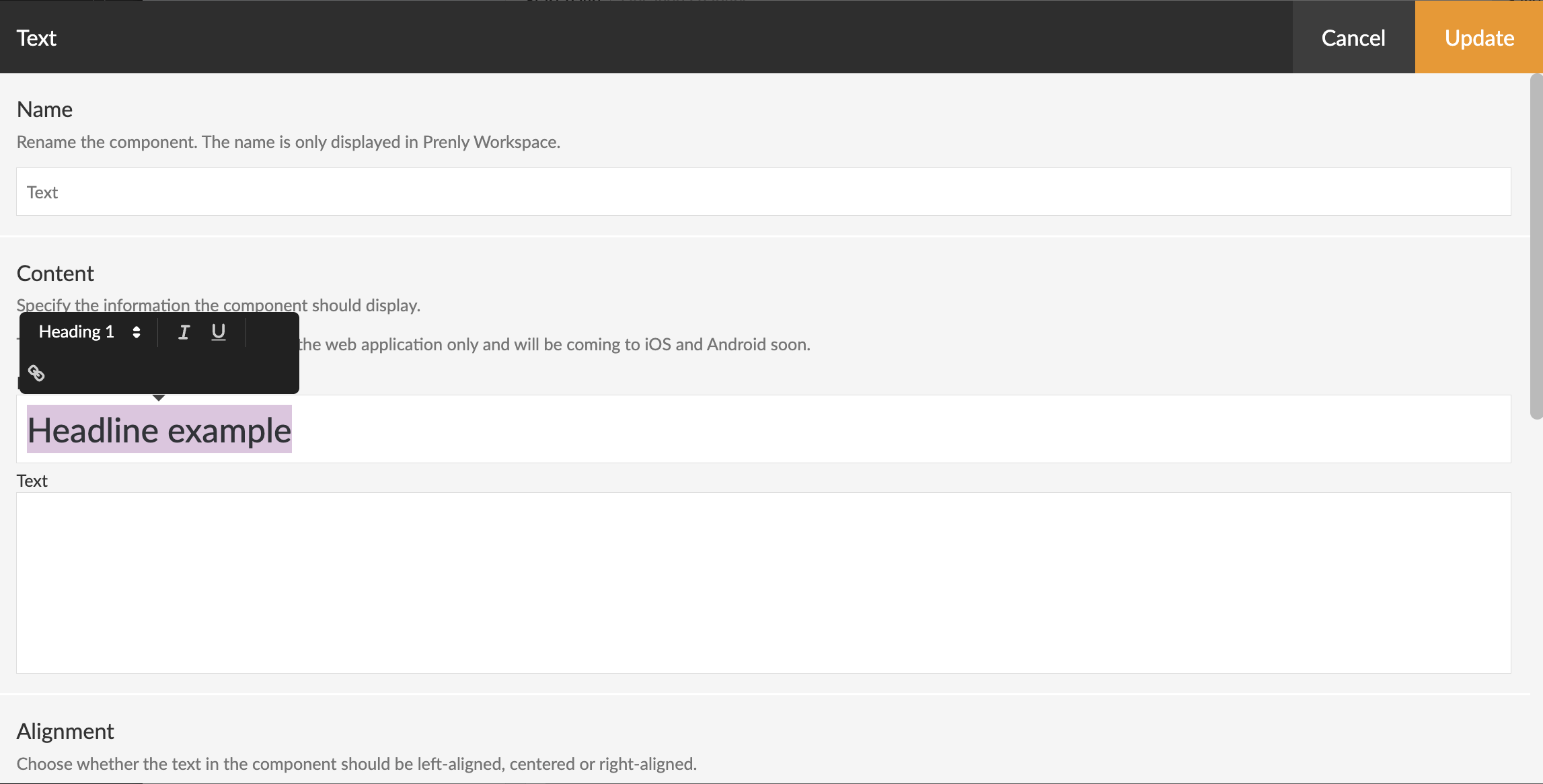 Screenshot from Prenly Workspace showing how to set the heading level.
Alternative image text for banner components
All banner components on the start page need alternative text (alt text) to enable visual description of the image.
In the banner component, there is a field labeled “Image alternate text” that you should fill in.
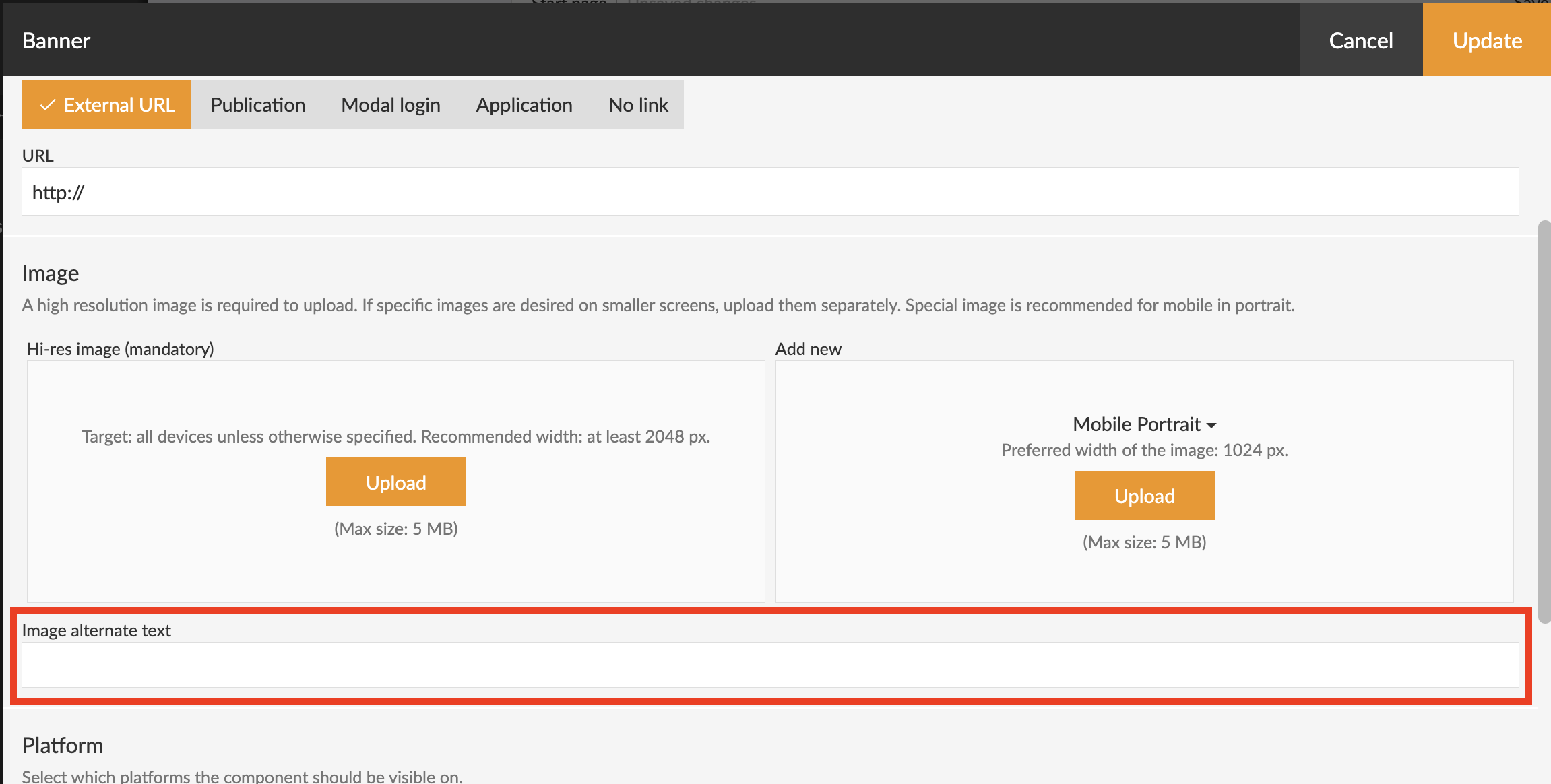 Screenshot from Prenly Workspace showing where the 'Image alternate text' field is located.
Colors and contrast
There are many colors you can adjust to visualise the applications in line with your brand.
Make sure that the color contrasts are sufficiently high — for example, between background color and button color, or background color and text.
There are different accessibility requirements for elements such as headings and body text, to ensure that as many people as possible can distinguish the information. You can adjust the colors in Prenly Workspace.
• For each start page component
You can find the setting by selecting Applications in the left-hand side menu, then selecting your application and the middle menu option Start page.
Choose to edit the desired component—either by clicking the component name in bold text or by using the three-dot menu and selecting Edit.
Scroll down to the Appearance section.
• Under ‘Color Theme’
You can find the setting by selecting Applications in the left-hand side menu, choosing your application, and then selecting Color Theme in the middle menu.
Then choose Custom Theme for each color theme category to set your own color.
For each color selection you make, a so-called HEX code is generated, which you can see when you click on a color box.
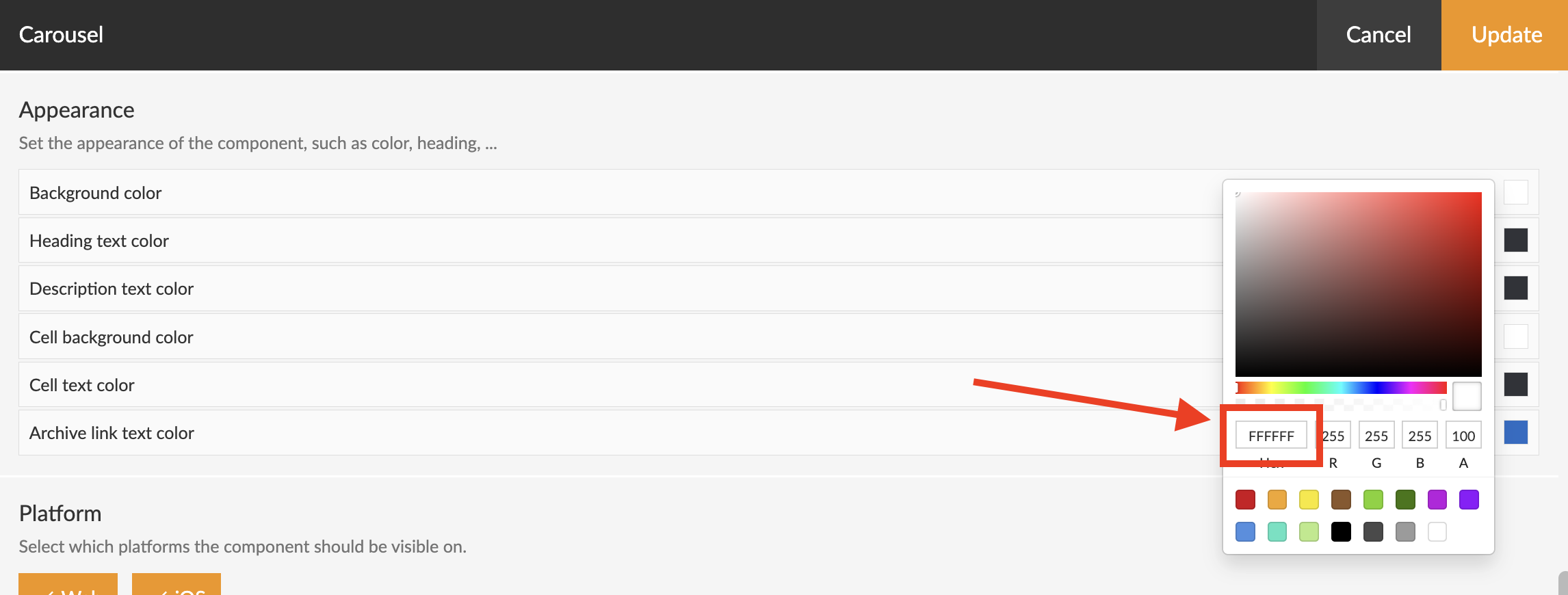 Screenshot from Prenly Workspace showing an example of where the HEX code is displayed.
There are different ways to test contrast. We have a dedicated tool for Prenly: Color Contrast – Accessibility Check.
There is also a general tool available from webaim.org: WebAIM: Contrast Checker.
Link copy
It's possible to adjust the link copy on some start page components. The copy should be descriptive, to ensure the user understands what will happen if they click the link. As an example 'Read more' is not recommended, but 'Open archive' is a better option.
This is especially important for users with screen readers.
If you have any questions, feel free to contact us.